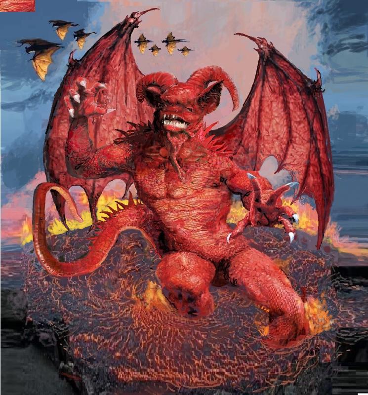
01/9/2023 I was asked by Chris Wright that I produced more devil images. Good natured and obliging as ever. here is one. That makes 32 so far.
Two things - it seems I do requests, and any interested book publisher should get in touch.
Love to see new work like…
Love to see new work like this from you here on the site (but would prefer a book, no screen-glare from paper !), this one is really nice.
Thanks and please keep them coming. If you're really doing requests, would you consider an 'inked' one - brush or pen, b/w or colour ? (your work in Mazeworld, etc., - outline with mostly constant rather than gradated colour reminds me of the same qualities as Japanese woodblock artists like Hiroshi Yoshida; where the scene/image is more or less communicated completely - but still engages the viewer to partly 'complete' it in her/his imagination because it is not strictly realistic (eg, like an oil, for instance). And outline + colour is simply very attractive on its own terms, too.
Also love the biro works you've posted here - they're like pencil but with extra force/resonance due to being ink.
Thanks & best wishes, Arthur.
Alan
Hullo Alan, did not know…
Hullo Alan,
did not know Hiroshi Yoshida so had a look on Google. His work has a lot to admire but confess to not feeling any connection.
Although I always wanted my work to look convincing I never thought of it as aiming to be 'realistic'. As you indicate there were other graphic qualities which were what I was after.
Biro offered a halfway house between pencil and pen and ink with some qualities of both which I enjoyed exploiting but arthritic fingers have discouraged me from using it of late. Much more comfortable to use a Mouse to work with in the Paint app. But like to draw so may well return to Biro.
All the best.
Arthur
PS. A book would be nice if any publisher is listening and thinks Demon book might make money for them.
I remembered reading a…
I remembered reading a comment you made about some comic art that had used the colourisation to give full 'in the round' dimension to the work using shading and highlights & so on, which I think you said was fine and valid as an approach but kind of went against the strengths of that kind of art where line was paramount (if I understood you right...?)
The earlier constraints of reproduction, I guess, may have determined that comic art would be line + (primarily) flat colour, but it created a lovely effect that corresponded in some ways to woodblock techniques and results. I mentioned Hiroshi because the western perspective etc he used show the similarities more-so than do the (beautiful) conventions of the earlier kind of Japanese woodblock prints.
Cheers !
Hullo Alan, that sounds…
Hullo Alan,
that sounds like something I might have said.
Could be my preferences are a little out of date but I do lean toward work that looks as though it has been inked then coloured.
I did use tinting and colour graduation at times but always wanted to maintain a certain flatness to the page. Am a fan of Hokusai.
All the best.
Arthur

